

Studio Band were brought in to re-imagine the branding of Waymouth Street’s Gallery Bar in a make-or-break move by the venue’s owners.
January 2, 2015
Commerce
Rooftop re-brand
- 1
- 2
- 3
Lazing around, surrounded by the greenery of Gallery’s rooftop bar on a balmy summer’s evening, the sun is setting, and you’ve finished work for the day. All is well with the world. Also — Gin and tonic.
The redesign of Gallery (previously The Gallery on Waymouth) was an enormous undertaking; not just a rebrand, but a new brand placement, a structural re-build and extension.
Gallery’s owners showed a great deal of courage when they embarked on this epic project, starting in June 2013 and only concluding in November of that year.
Faced with an under-performing business, it was either rebrand and expand, or pack up and go home.

The problem was there was little space and the existing space wasn’t being used effectively.
Not ones to give up easily, the owners of Gallery expanded into the building next door, and engaged interior architecture firm studio-gram to create and streamline the flow of a new interior space.
Gram immediately approached Chris Cooper and George Randle from graphic design studio Band to work on the brand of the venue.
“It was quite unique because we got to collaborate with them from the beginning,” says George.
Graphic design as an industry is beginning to engage in more collaborative projects with architects and interior architects to produce more holistic, functional spaces. Gallery is a great example of how well this type of collaboration can work.
While Band and studio-gram were puzzling over a new look and feel for the business, new stairwells and a lift were installed, and the size of the roof was extended.
“They tripled the floor area of the rooftop. It went from being licensed for around 80 people on the rooftop to about 180,” says George.
Having expanded — to the ire of some surrounding businesses — licensing limitations then began to drive the design brief. Part of their agreement with the Licensing Board states Gallery must always have art displayed in an exhibitive format on all three floors.
“We tried to pick up on the visual elements of a contemporary art gallery and convey those key elements, especially throughout the second-floor space — there’s a lot of white space and high ceilings,” says Chris.

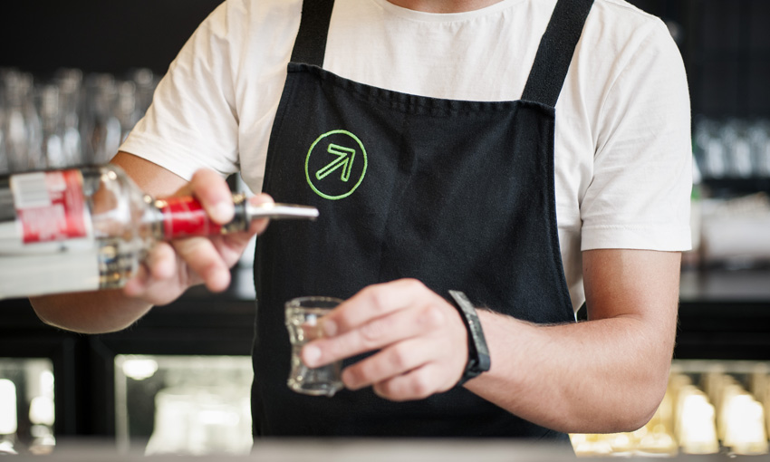
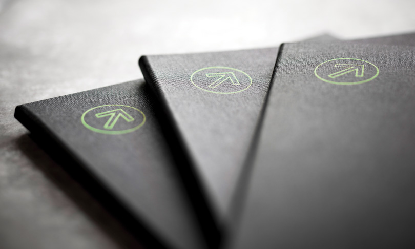
Sticking with the gallery theme, Band designed an elegant wayfinding device common to galleries around the world: the arrow.
And the arrow was what Band used to attract and drive traffic up to the rooftop bar. To do this, they needed to turn attention from the old Waymouth street entrance — now a fire exit — to the new entrance on Anster Street.
“We thought with the green neon arrow pointing up toward the garden rooftop, we could draw people around the corner to the new entrance,” says George.
Once inside, you find a highly-detailed narrow ground floor gallery and function space with warm colours and exposed rock walls. The dark colours of this space are reflected in the Gallery light-box signage — featuring white type framed in deep black — which reaches out onto the street.
The arrows point you to the second floor gallery and function space. Compared to the floor below, this space is stark, white, and much wider.
The same exposed rock walls are used here too, but painted white in an endearingly haphazard way. Band created a gigantic white neon G that sits in the centre of the second-floor window facing the street and can be seen by would-be patrons from all the way down Franklin Street.
Chris points at that building across the street and suggests, “there’s 1,000 people right there looking in this direction, thinking ‘let’s get a drink’.” CityMag tends to agree.
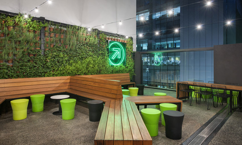
One more arrow and several stairs later, we’re in the highly decorated rooftop bar — Gallery’s flagship space. There is so much green that we feel like we’ve climbed into a garden. Which, it turns out, we have. The south-eastern wall is covered in potted herbs used for cooking and for drinks. Nestled into the green wall is Gallery’s signage centrepiece, a giant green neon arrow which is visible from the street.
Remarks
The Gallery re-brand project was short-listed for the 2014 Eat Drink Design Awards in Melbourne and was also nominated for the Desktop Create Awards 2014: Signage & Display.
“We really wanted to pick up on the details and the colour palettes in the three spaces and integrate the signage into those areas,” says George.
This was an all-or-nothing project for the Gallery owners. Happily, their investment seems to have paid off. The rooftop bar fills instantly at the merest hint of sunshine, and the bottom two levels are consistently booked for functions.
Share —